top of page
NORDSTROM RACK | THE RACK × NIKE | 2018
NORDSTROM RACK × NIKE
CAMPAIGN IDENTITY & PRODUCTION
As the off-price sister of Nordstrom, The Rack carries a number of popular brands. For the first time, Nike granted The Rack the opportunity to advertise their collection at their stores through an exclusive campaign. This featured in-store signage, window clings, and digital ads. This was the first project I designed on my own for The Rack’s in-house creative team, working closely with marketing and overseen by my manager.

This partnership was a big deal for The Rack to get to feature front and center in stores, so the campaign had to be eye-catching. The look also had to feel on-brand for both Nike and The Rack, and everything had to be approved by both Nordstrom and Nike’s marketing teams.
The pieces that were the most challenging to design were the store window clings. At the Seattle and New York flagship stores, specifically. These stores have large, floor to ceiling windows in high-traffic areas. Because of those factors, the messaging has to be bold and legible, and some installations extended across the entire length of the stores.
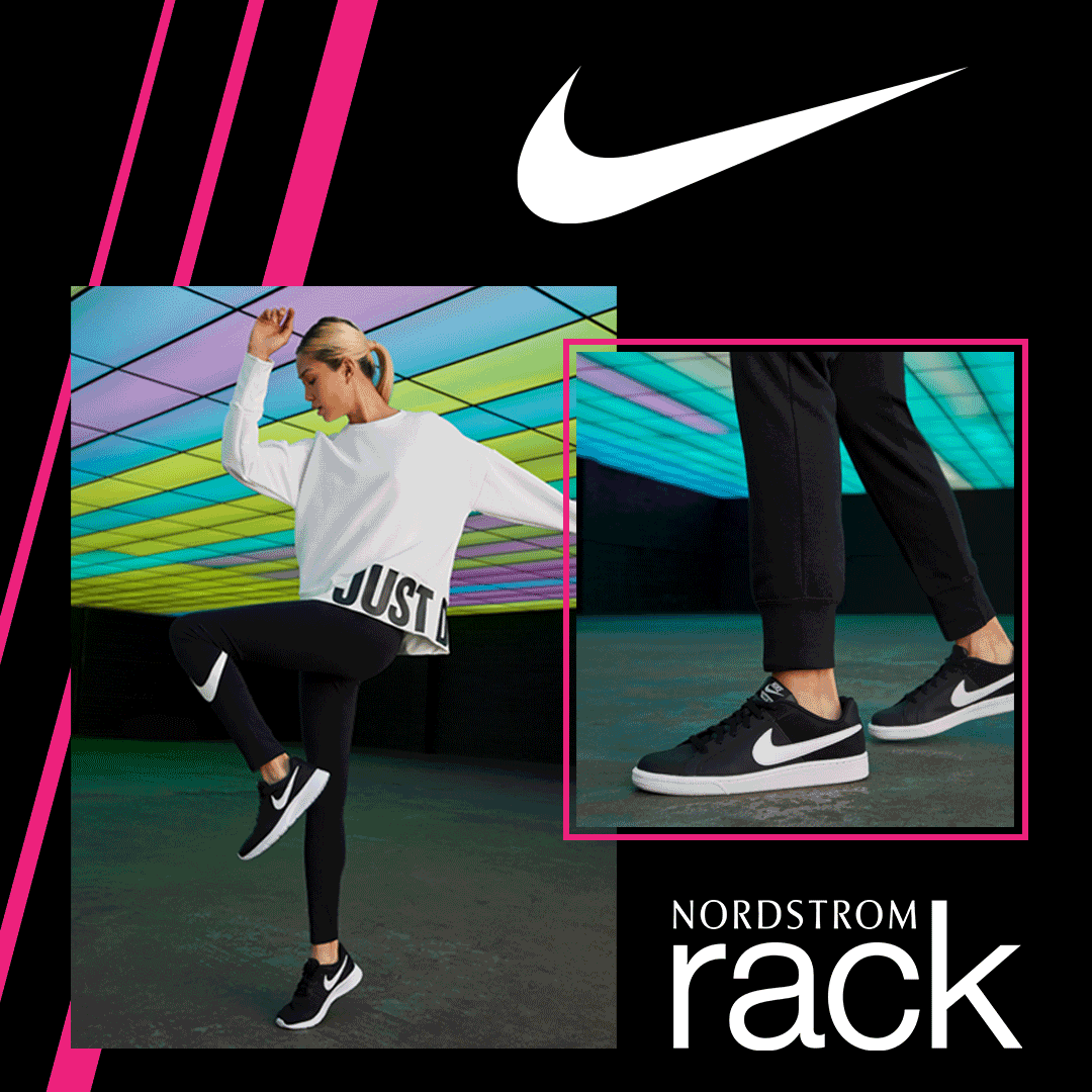
The colors of the activewear collection was mostly Nike’s signature black and white, with bright neons mixed in. The Rack photo studio shot photographs of the product with a wall of brightly colored lights behind the models that added extra energy to the photos. To match that energy, I chose a bold, high contrast palette that consisted of a black background, white knockout type and logos, and a bright magenta accent color.


Because this was ultimately a campaign for Nordstrom Rack, I stuck to their type kit, but incorporated Brown’s Bold Italic weight as a nod back to Nike.
To create a seamless look for the windows (especially for the extra long elevations), I created a motif of angled lines to frame the images and add more interest to the design. Photos and black background would be broken up with magenta lines of varying widths. Because a lot of black was used, I included transparent gaps to let some natural light into the stores. I also worked with our retail experience team to find a substrate that would let additional light in through the printed material, but appear solid when viewed from the exterior.
This campaign was mutually beneficial, as the energetic signage and advertising was show-stopping from great distances and brought in customers to stores. Nike and The Rack are still great retail partners to this day.


1/3

bottom of page